This lovely WordPress theme enables a nice mobile view using CSS Flex functionality. The index.php below has 2 columns for content. The two columns will be stacked as rows if the screen is less than 600 pixels wide.
1 2 3 4 5 6 7 8 9 10 11 12 13 14 15 16 17 18 19 20 21 22 23 24 25 26 27 28 29 30 31 32 33 34 35 | <!DOCTYPE html> <html lang="en"> <head> <meta charset="UTF-8"> <meta name="viewport" content="width=device-width, initial-scale=1.0"> <title>Australian Radio and TV</title> <link rel="stylesheet" href="style.css"> </head> <body> <header> <h1>Radio and TV</h1> <nav> <ul> <li><a href="#">Home</a></li> <li><a href="#">About</a></li> <li><a href="#">Services</a></li> <li><a href="#">Contact</a></li> </ul> </nav> </header> <main> <section> <h2>Section 1</h2> <p>Lorem ipsum dolor sit amet, consectetur adipiscing elit. Sed pellentesque massa sit amet facilisis fermentum.</p> </section> <section> <h4>Sidebar</h4> <p>Phasellus sed mi ac purus fringilla dapibus. Fusce ultrices facilisis odio at consequat.</p> </section> </main> <footer> <p>© <?php echo date('Y'); ?> Your Site Name. All rights reserved.</p> </footer> </body> </html> |
And the style.css file. This enables Flex functionality to enable one theme to work on either a mobile or a desktop.
1 2 3 4 5 6 7 8 9 10 11 12 13 14 15 16 17 18 19 20 21 22 23 24 25 26 27 28 29 30 31 32 33 34 35 36 37 38 39 40 41 42 43 44 45 46 47 48 49 50 51 52 53 54 55 56 57 58 59 60 61 62 63 64 65 66 67 | /* Reset some default styles for consistency */ body, h1, h2, h3, p, ul, li { margin: 0; padding: 0; } body { font-family: Arial, sans-serif; line-height: 1.6; background-color: #f0f0f0; color: #333; } header { background-color: #007bff; padding: 20px; color: #fff; display: flex; justify-content: space-between; align-items: center; } nav ul { display: flex; list-style: none; } nav li { margin-right: 20px; } nav a { text-decoration: none; color: #fff; } main { padding: 20px; display: flex; flex-wrap: wrap; justify-content: space-between; } section { flex: 0 0 48%; margin-bottom: 20px; padding: 10px; background-color: #fff; border: 1px solid #ddd; } footer { background-color: #007bff; color: #fff; padding: 10px; text-align: center; } @media only screen and (max-width: 600px) { main { flex-direction: column; } section { flex: 0 0 100%; } } |
This should be very helpful if you are desiring a useful mobile theme for WordPress and you are looking for a suitable solution. Below is what the theme looks like, this is amazing. It really does work very well, if you want a 2 column theme for WordPress, this should be a good starting point.
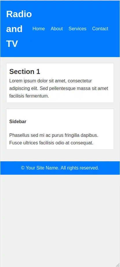
And this is a demo of this theme in action.